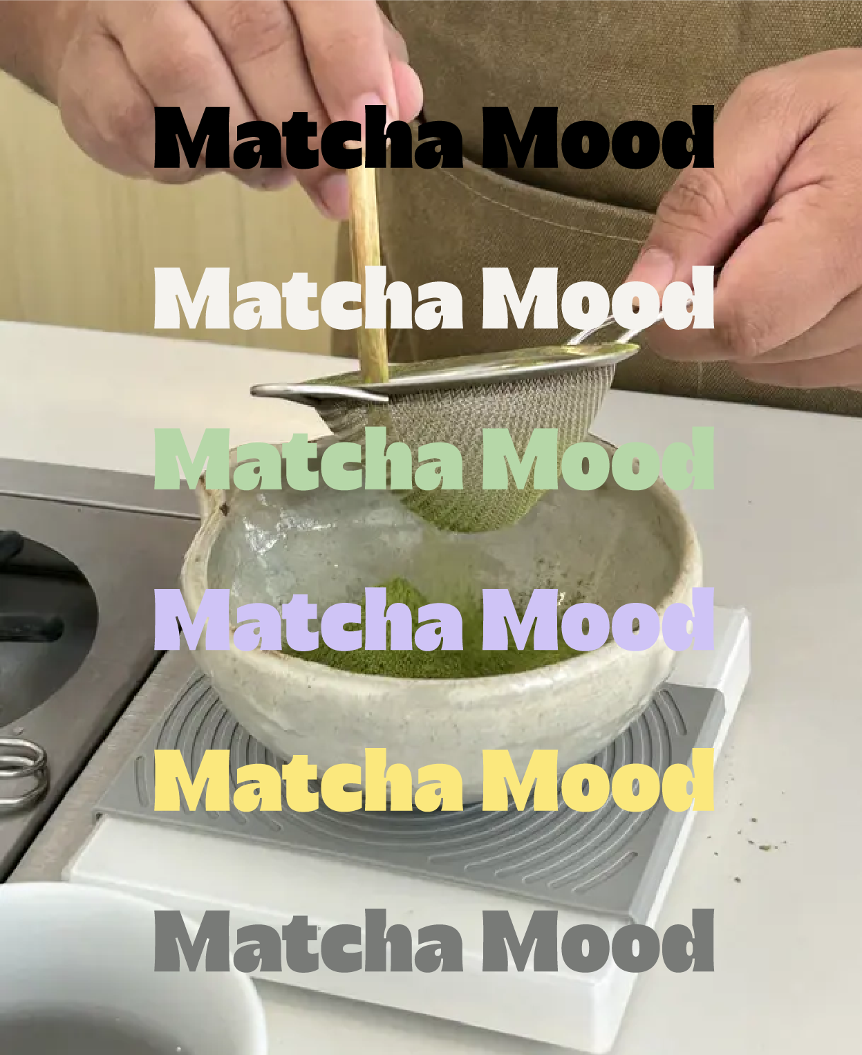
Matcha Mood
Allow Us to Introduce You 🤝🏽
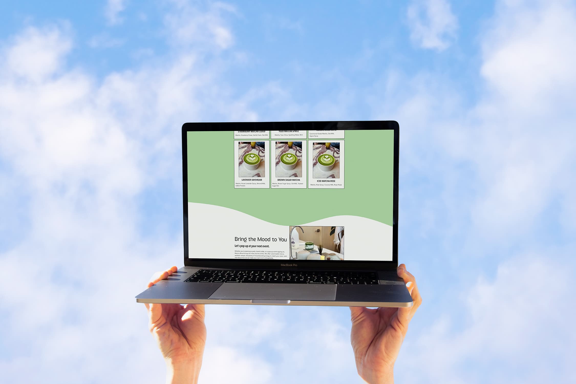
The Scope of the Project 👀
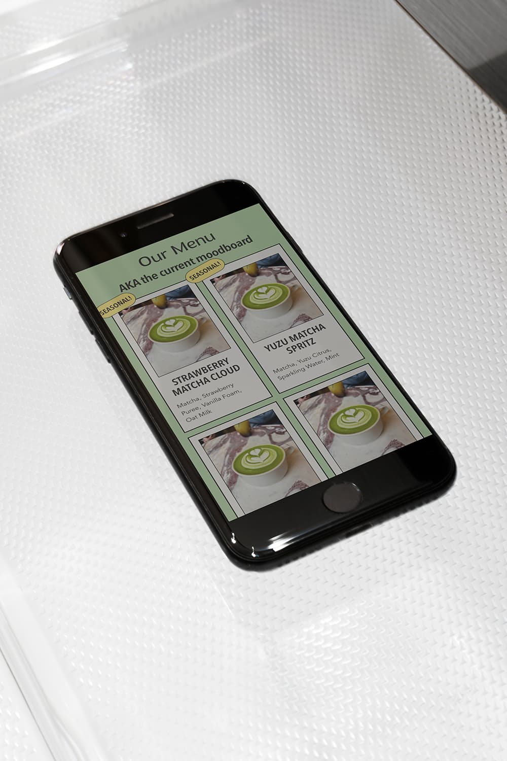
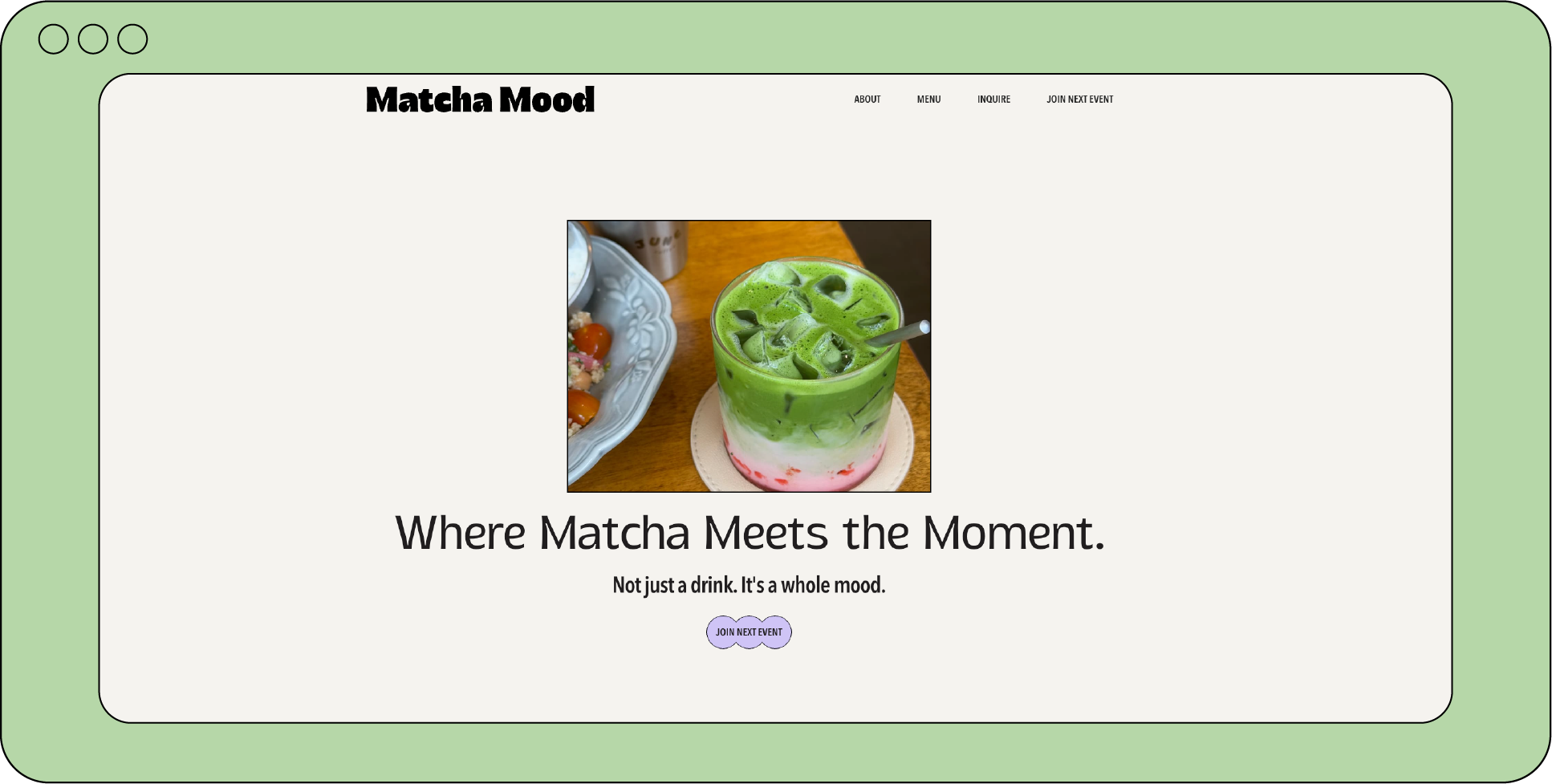
Since Matcha Mood operates mainly as a pop-up matcha bar, we decided to keep things streamlined with a one-page website. The goal was to create a clean, impactful digital presence that reflects the brand’s personality while making it easy for visitors to find the most important info—like where to get their matcha fix next.
✨ Featured Section: Events with a Scroll Experience
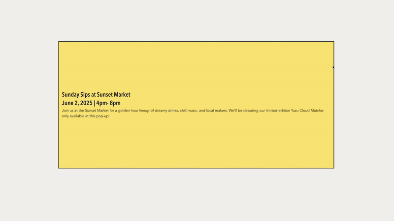
Because Matcha Mood thrives on events and pop-up moments, we made the Events section the star of the site. To draw attention to upcoming dates and locations, we built a sticky, scroll-based interaction using GSAP animations. As users scroll, they’re guided smoothly through each event—making the section feel dynamic and impossible to ignore. It's not just about listing events—it’s about creating a mini experience within the page.
Our Research 🧐
For this project, we kept our research light—our client (aka ChatGPT 😅) came prepared with a clear vision. Instead of deep market analysis, we focused on understanding the vibe of the brand and its audience so we could design intentionally around it.
Target Audience
Matcha Mood is made for Gen Z and younger millennials (ages 18–33) who care just as much about the vibe as the flavor. They’re the type to follow café TikToks, spend their weekends at farmers markets, and take photos of their drinks before sipping. Health-conscious but indulgent, they prefer oat milk over dairy, but still want matcha foam and a brown sugar rim.
Meet Sunny, Our Target Persona ☀️
Sunny is 24, a freelance social media manager/content creator based in Austin, TX. She thinks in aesthetics, collects enamel pins, and has a curated playlist for every mood. She's over the coffee jitters. What she wants is something intentional and cute. Matcha Mood gets her—and she’ll happily hype up every seasonal drop on her story.
Web Direction
When planning layout, we referenced modern pop-up and beverage brand websites, prioritizing a scrollable one-page experience with an emphasis on mobile usability. We leaned into bold typography, sticky scroll effects, and clean sections that guide the user through the brand story—without overwhelming them.